


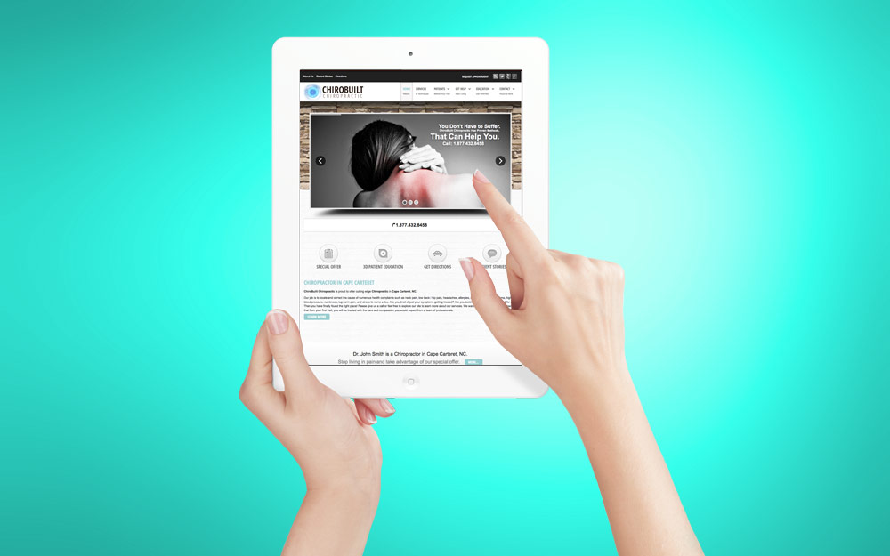
The FLEX is not only mobile ready, but it is responsive. Wondering what responsive means? Responsive is a web design approach aimed at crafting sites to provide an optimal viewing experience—easy reading and navigation with a minimum of resizing, panning, and scrolling—across a wide range of devices (from mobile phones to desktop computer monitors). The FLEX adapts the layout to the viewing environment by using fluid, proportion-based grids, flexible images, and a entirely special set of embedded design code.
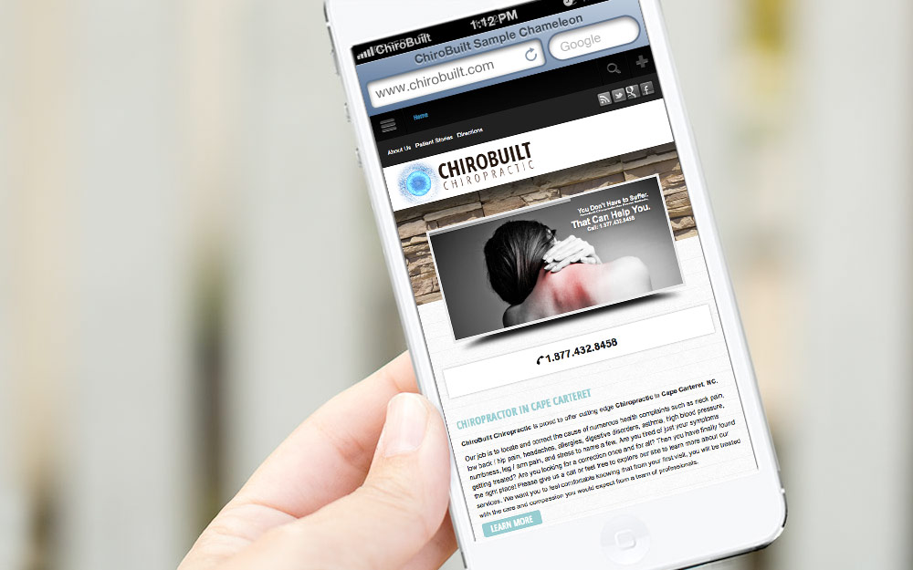
The number of mobile internet users should reach 2.1 billion in 2013 overtaking the number of users of fixed Internet (1.9 billion). If your website is not mobile ready - responsive, you will be losing out on new patients. We can also customize the mobile version of your website. For example, if you want a set of icons to show up on your desktop version, but not the mobile version then consider it done with the FLEX. The Chameleon also offers the custom mobile website feature as well. The Chameleon is mobile ready, but not responsive like the FLEX.
Mobile Ready and Responsive
Your Site Will Look Professional on Any Device
-
FLEX Overview +
 Get ready to stand out from your competition when you choose the FLEX for your chiropractic website. Read More
-
EasyAdmin +
 You have complete control. Read More
-
HomePage Slide Show +
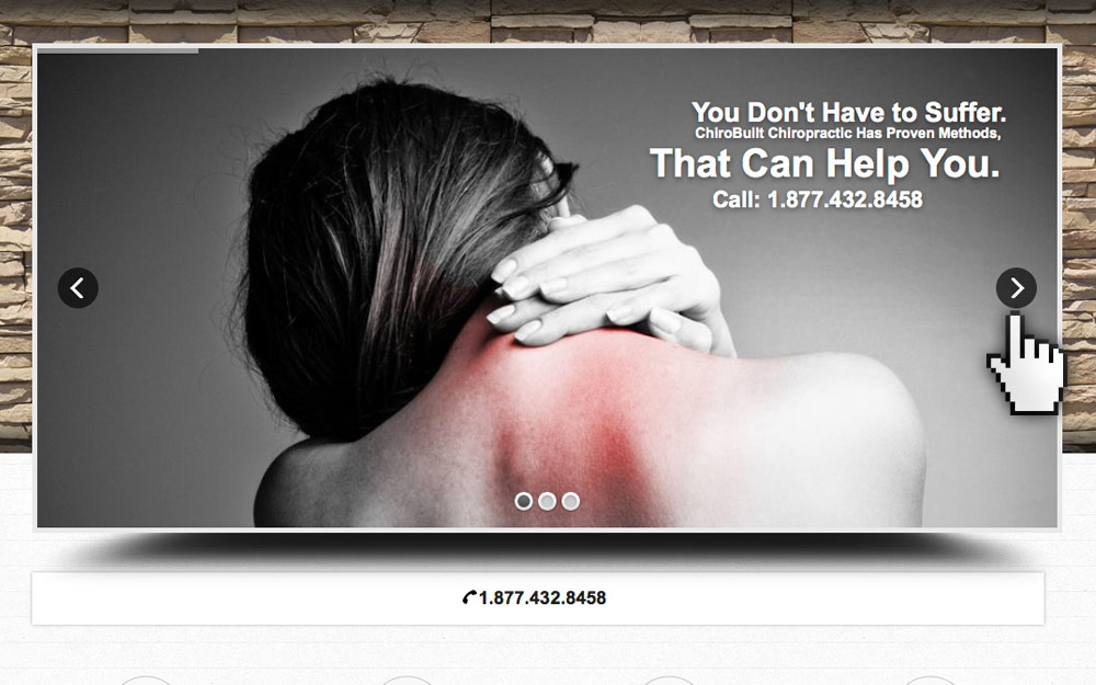 Our Homepage Slide Show app creates a dynamic viewing experience. Read More
-
Menu Manager +
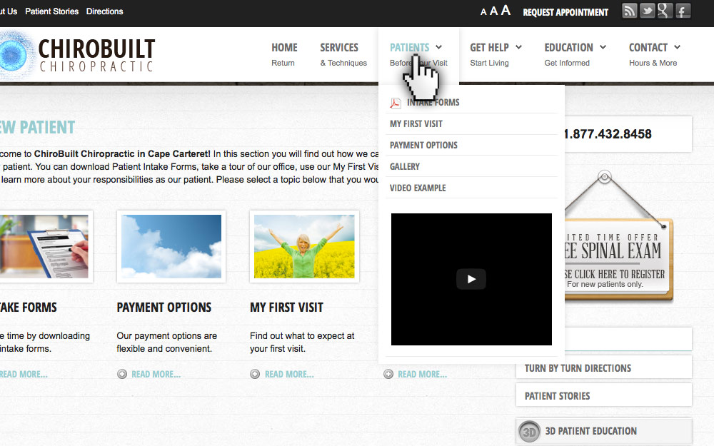 Manage your menu navigation on the fly. Read More
-
Mobile Ready +
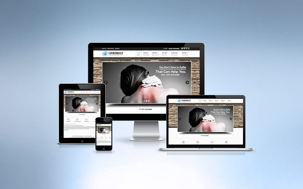 If your website is not mobile ready, you will be losing out on new patients. Read More
-
Newsletter +
 Newsletter marketing right at your finger tips. Read More
-
ProActive SEO +
 Chiropractic internet marketing that won't break the bank. Read More
-
3D Patient Education +
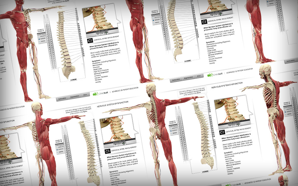 Amazing Interactive 3D Patient Education Read More
- 1